i made a Bitsy game
Here it is. Press (or swipe) up-down-left-right to play.1
Bitsy is a micro-game creation tool by Adam Le Doux. To get a feel for what it can do you could check out Claire Morwood’s tutorial or the excellent videos by Dan Cox and Rob Duarte.
When I discovered Bitsy, I was excited by its all-in-one minimalism, which invites you to actually get a game done, instead of maybe struggling to get something more complex off the ground. Having started teaching game development this year, this seemed like a good way to ease the impostor syndrome. Along the way, I discovered Bitsy can also be a good medium for teaching and dissemination.
My game is very short and has 3 possible endings. If you haven’t already, you can scroll up and play it before reading on.
What are we looking at?
If, like me, you’re not great at drawing, and you think pixel graphics might make things easier, well, it’s not that simple. I’ve found that this kind of art, while super fun (and apparently easy) to make, can be deceptive. Things that look obvious to me once I’ve drawn them, are something completely different in someone else’s perception. And of course, if I tell you what they’re meant to be, then like me, you can’t unsee them, so I’d need to find other fresh eyes to bounce off of.

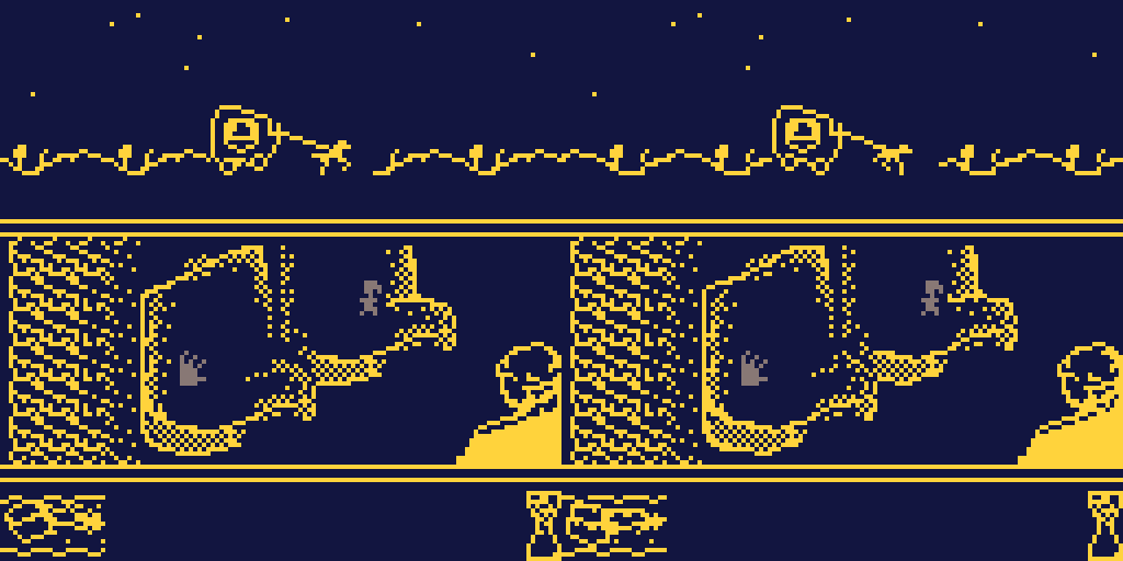
An example of this is the horse-drawn carriage, and the scrolling hillside on the top third of the window. My partner thought these2 were some sort of jellyfish floating among waves. Oops.
The middle section is where the action takes place. There’s two seats in the carriage, for the player and the titular Albertine. Sitting opposite are Dr. Cottard and his (off-screen) wife, who cannot see you in the dark but sometimes have things to say.
There are basically two things for you to do: wait for time to pass (by moving around [in] your seat), or get busy with Albertine (by bumping into her). Depending on how much, and when, you do these things, you get to one ending or another once the carriage reaches the station.
The bottom section of the screen is meant to show the distance travelled, and the passage of time. Since, again, my pixelling skills are questionable, I added an hourglass to be extra sure.
Wait, what are we doing?
Now, a game where the main mechanic is bumping into a young woman isn’t necessarily the best idea in the world. I don’t think I’d ever have tried something like this, if I hadn’t been reading Proust, where I took this scene from. Over the past year, In Search of Lost Time is basically the only fiction I’ve exposed myself to, and when I discovered Bitsy, this bit, of the narrator and Albertine coming back from a party and “making the most of the darkness,” was fresh in my mind.
Proust’s epic is rich with tensions. The excitement of fooling around with your lover, contrasted with the decision to break it off with her, is an interesting theme to explore. Will people pick up on it? Maybe not, but there it is.
If you still think all this is in poor taste, I won’t argue with you. Let me just mention that the book goes much further, for what that’s worth…
How’s it made?
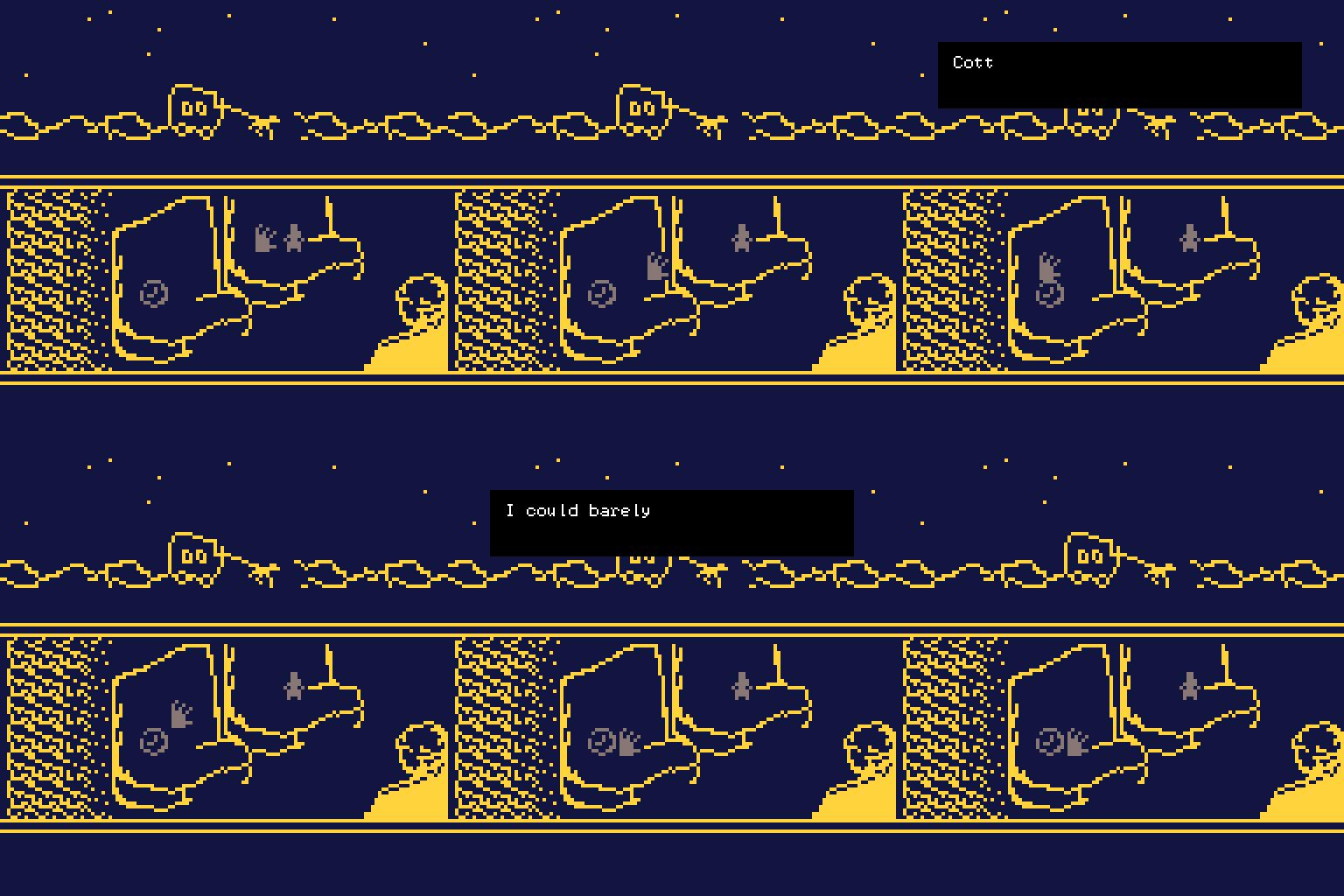
Bitsy doesn’t have a notion of time, so I had to think of a way to implement the “waiting” mechanic. My first idea was to have a pocketwatch sprite, which the user could bump into to make time pass:

I showed this to friends and they didn’t get it at all. Also, they asked for more feedback from the game. So I decided to do the invisible item trick, present in many Bitsy games: the blank tiles in your seat are actually collectible items that increment the time variable, and occasionally trigger narrative text.
The Bitsy community has contributed all sorts of interesting hacks which extend the capabilities of the engine. Initially I resisted the idea of using them, but some really come in handy to make your game richer and (at least in my case) comprehensible. Together with Borksy and Bitsy Savior, you can do some neat things. I used:
- Edit Room from Dialog
- Dynamic Background Color
- Exit from Dialog
- Transparent Sprites
- Sprite Effects
Also, if I had to start over, I’d use pixsy to draw my backgrounds. You can usually tell when a Bitsy game is done this way—getting 1-bit pixel art to look good is hard enough without having to draw it one 8x8 tile at a time.
Oh well, this should be alright for a first attempt. Figuring out how the game works is part of the challenge, which is maybe not that motivating, but might tickle some people’s fancy. I’d appreciate any feedback (on twitter or itch), since by now I’ve lost all perspective.
-
If you haven’t played a Bitsy game before, maybe start with a better one to get a feel for the style. ↩
-
rather, the initial version, which you can see below, in the image with the ⌚ sprite. ↩